Visualize dynophores: Statistics
We will show here how to use the dynophores library’s interactive plotting options.
[1]:
%load_ext autoreload
%autoreload 2
Note: When you work in Jupyter notebooks, use the matplotlib Jupyter magic to enable the jupyter-matplotlib backend which makes the plots interactive.
%matplotlib widget
We do not make use of the cell magic in this documentation notebook because it seems to conflict with rendering the plots on websites.
[2]:
from pathlib import Path

import dynophores as dyno
Set path to DynophoreApp output data folder
[3]:
DATA = Path("../../dynophores/tests/data")
dyno_path = DATA / "out"
Load data as Dynophore object
[4]:
dynophore = dyno.Dynophore.from_dir(dyno_path)
Statistics
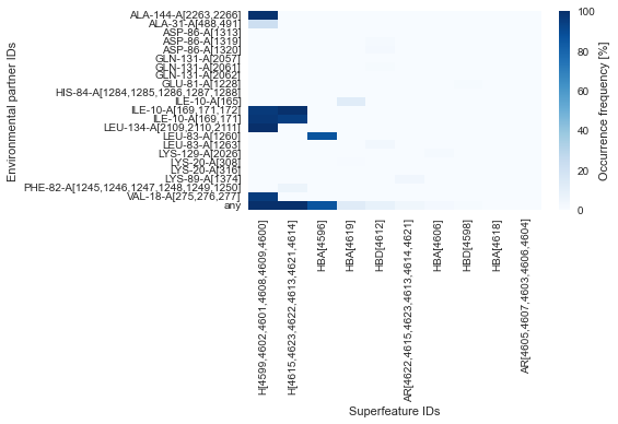
Plot interactions overview (heatmap)
[5]:
dyno.plot.interactive.superfeatures_vs_envpartners(dynophore)
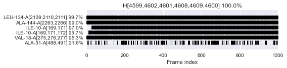
Plot superfeature occurrences (time series)
[6]:
dyno.plot.interactive.superfeatures_occurrences(dynophore)
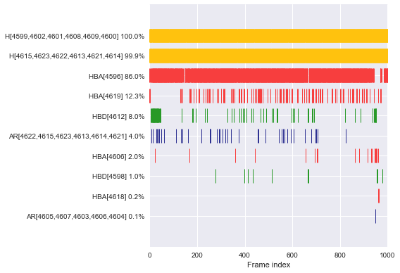
Plot interactions for example superfeature (time series)
Interaction occurrence
[7]:
dyno.plot.interactive.envpartners_occurrences(dynophore)
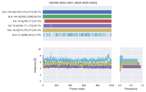
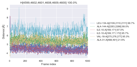
Interaction distances (time series and histogram)
[8]:
dyno.plot.interactive.envpartners_distances(dynophore)
Interaction profile (all-in-one)
[9]:
dyno.plot.interactive.envpartners_all_in_one(dynophore)